
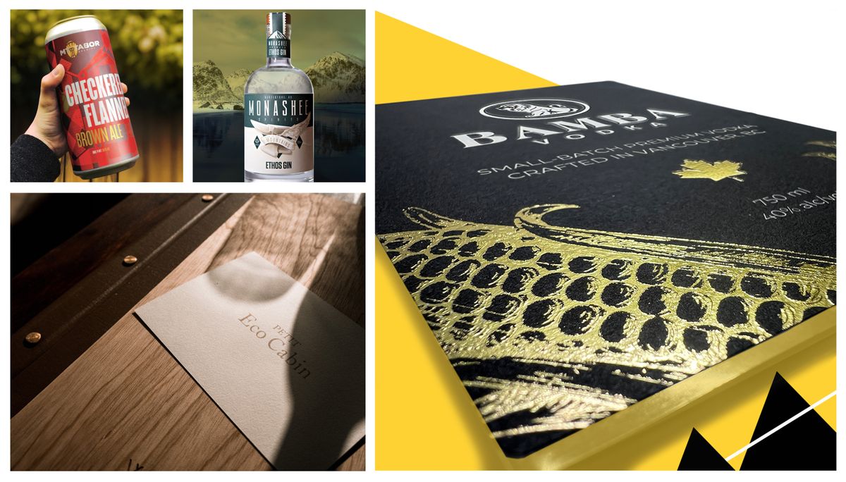
Selecting Appropriate Colors for Business Branding: Understanding the Psychology of Color
Color plays a significant role in conveying your business's message and setting the right tone for your logo and brand identity. Environmental psychologists have conducted extensive research into the impact of colors on our thoughts and behaviors, offering valuable insights for small business branding. In this guide, we'll explore color psychology in business and provide guidance on selecting the right colors for your brand.
Blue: The Trustworthy Choice
Blue stands out as the most popular color for marketing materials. It's a global favorite, possibly because of its historical associations with elements like clear skies and water sources. Blue signifies competence and trustworthiness, making it an excellent choice for finance-related businesses and those requiring high levels of trust, such as medical practices or veterinary offices.
However, it may not be ideal for the food service industry due to its supposed appetite-suppressing effect. If you still wish to use blue in restaurant branding, consider lighter shades or blue-green hues.
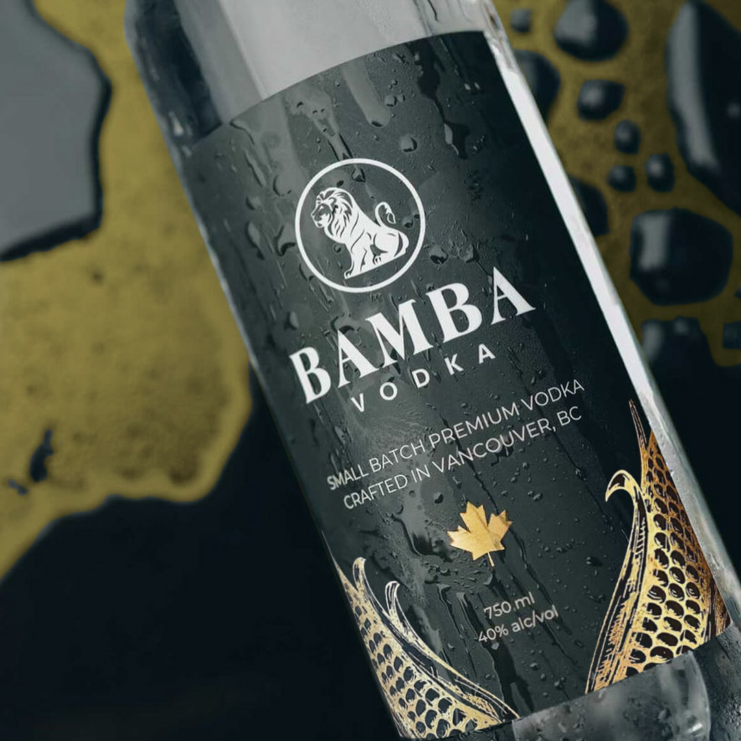
Black: Strength and Sophistication
One of the primary associations with black is strength. When used in branding, it can convey a sense of robustness and authority. For businesses aiming to project a powerful image, such as high-end technology companies or luxury brands, black is a go-to color.
Black exudes sophistication and timelessness. It's a color that transcends trends, making it a reliable choice for businesses that want to establish a lasting presence in their market. Fashion houses, upscale restaurants, and luxury car manufacturers often choose black as a cornerstone of their brand identity.

White: Versatile Simplicity
White, being a neutral color, offers versatility and can suit almost any industry. It represents modernity, simplicity, and cleanliness. Small businesses in the technology and health sectors, as well as upscale retailers, can embrace white as their brand color. It also complements vibrant primary colors when used as an accent.
Green: Inspiring Creativity
Brief encounters with green have been linked to enhanced creative thinking. Therefore, it's a smart choice for marketing materials when creativity is central to your appeal.
Green is associated with nature and environmental responsibility, making it suitable for eco-conscious businesses. It also signifies spring and rebirth, making it ideal for businesses facilitating fresh starts, such as dietitians or tutors.
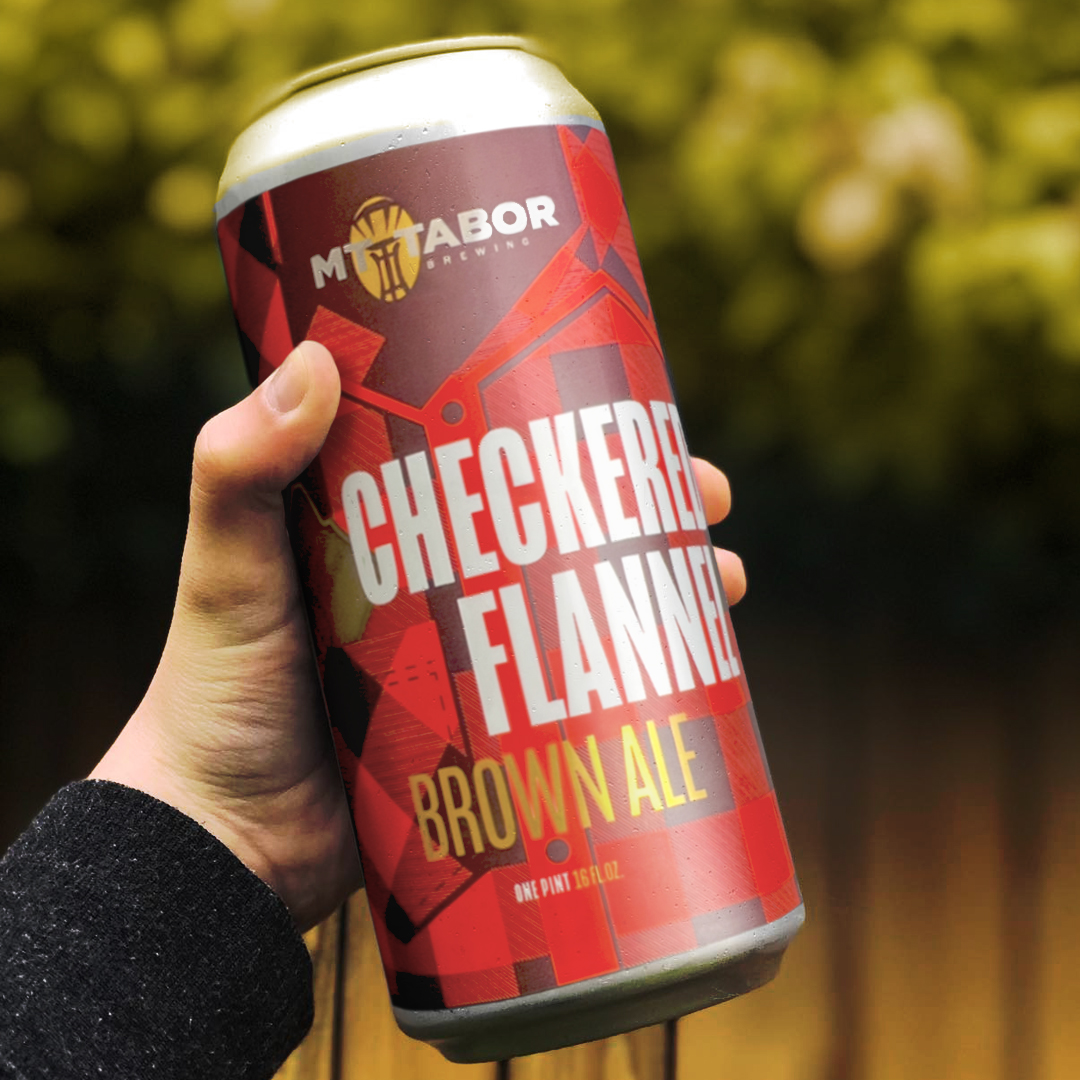
Red: Love, Energy, and Appetite
Red is associated with love, danger, and excitement. It may temporarily affect analytical reasoning but can provide a burst of strength when used on walls or surfaces, making it suitable for gym settings. Additionally, red is known to stimulate appetites, making it an excellent choice for eateries of all types.
Pink: Versatile and Youthful
Pink represents romance and femininity, making it ideal for businesses targeting a primarily female audience. Its wide range of shades lends a youthful energy that works well for technology and fast-food brands.
Pink offers a wide spectrum of shades, from pale pastels to vibrant magentas. This diversity enables businesses to fine-tune the message they wish to convey. Softer pinks can communicate a sense of calm and tranquility, while brighter pinks exude excitement and energy.
Purple: Luxury and Innovation
Purple combines the excitement of red with the calmness of blue, creating an aura of luxury, innovation, and femininity. While not as common as pink in female-oriented brands, it's an excellent choice for beauty, skincare, or luxury retail businesses.

Orange: Energy and Boldness
Orange, blending the excitement of red with the friendliness of yellow, communicates energy and boldness. Consider it for gymnasiums, travel companies, or toy stores. However, like yellow, orange can be perceived as a "cheap" color, so it may not align with high-end branding.
Orange is also associated with friendliness and approachability. It can create a welcoming atmosphere, making customers feel at ease. This quality is appealing to businesses in hospitality, customer service, and retail, as it helps foster positive customer interactions.
Gray: Balance and Neutrality
Positioned between black and white, gray symbolizes balance and neutrality. It's a perfect choice for professionals, such as lawyers, financial planners, and accountants, as it exudes seriousness and corporate appeal.
Yellow: Cheerfulness and Affordability
Despite being less favored overall, yellow communicates cheerfulness, accessibility, energy, and friendliness. Sometimes, it's associated with affordability, making it suitable for fitness studios, casual restaurants, or businesses aiming to convey budget-friendliness.
In conclusion, the colors you choose for your brand convey important messages. These color associations can be influenced by personal experiences and cultural factors. Before finalizing your brand colors, seek feedback from friends, family, and potential customers. Keep in mind the principles of color psychology and the science of perception as you make your selections.