
How To Select Packaging Colors for Your Product?
Are you designing product packaging?
Most people carefully research packaging material types but forget one of the most crucial things. It is choosing the suitable color for your product packaging.
It plays a significant role in branding and connects the target audience with your brand. But here's the biggest mistake you should never make.
It is: not researching if your brand colors align with the goals of product packaging. There are many questions you might have in mind.
Is putting so much time and effort into choosing product packaging worth it?
And if yes, then how can you do it?
According to a study, 80% of consumers instantly recognize a product's brand because of its unique color. This all comes down to understanding the psychology of color. In this post, we'll briefly discuss packaging colors and a step-by-step guide on how you can select colors for your product packaging.
So keep reading to make your product packaging unforgettable.
Role Of Color In Packaging Of Product
In branding, colors are of huge importance. There's science behind choosing the suitable color for your products.
The colors have a significant impact on the perceptions of the customers. That's why brands spend a lot of money and time choosing the right color palette for their branding needs.
Let's learn more about it by understanding deeper concepts.
What is Color Psychology?
Color psychology is a field of study that explores how colors can influence human emotions, behaviors, and perceptions. It tells us that certain colors can evoke specific psychological and physiological responses.
It impacts individuals on both a conscious and subconscious level.
The primary objective of product packaging is to catch the customer's attention. So they feel attracted to your product and ultimately purchase it. Brands choose colors that trigger specific consumer behavior. It can be purchasing a product, having a positive brand perception, trusting them, etc.
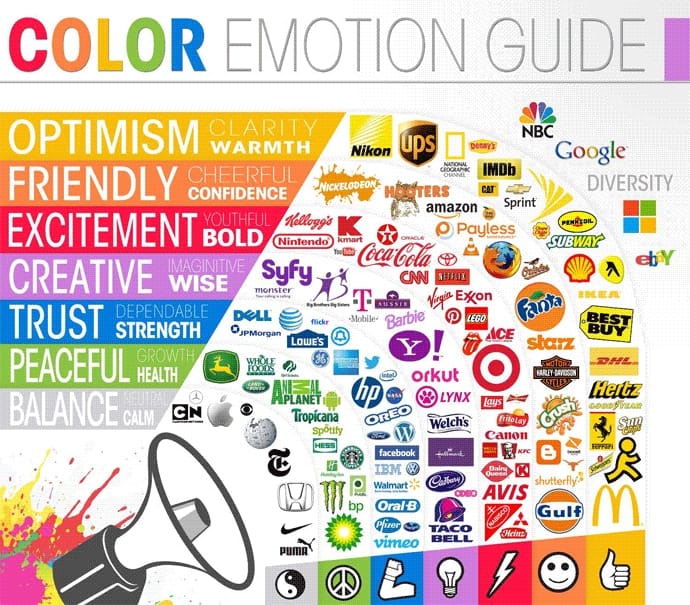
Source: helpscout
But here's an important thing. Color psychology varies from one individual to another. Why?
Because they perceive it differently. It depends on factors such as your target audience:
- Age
- Gender
- Demographics
- Cultural preferences
Certain colors are known to be universal in regard to perception. The ideal example of this is the Color Red.
It's associated directly with love and anger. Meanwhile, blue and green colors evoke calmness and peace. That's how every color tells a different story. You can use it to share your story with customers uniquely.
How Colors Influence Brand Perception & Marketing?
Visual representation of your brand is extremely important because it speaks a lot about your brand. If you analyze, you'll notice how brands use color psychology to influence you.
Coca-Cola, Red Bull, and Lego use red color to excite people and attract them to their products. Likewise, Twitter, Facebook, and IBM use a superior color palette. They use blue, which shows trust.
These brands have made carefully articulated marketing strategies to choose the perfect combination of colors. What are the results?
They easily persuade potential customers. These unique colors also improve their product positioning and make them stand out.
Brand Colors Perception For Different Industries
Nowadays, the world is evolving quickly. Customers will look at your packaging and decide whether or not they want to know your story.
So, if you're not using product packaging correctly, you're leaving a lot of money on the table.
How a company interacts with customers has a huge impact on brand perception. The first interaction is usually product packaging, so you should leave a long-lasting positive impression on the customer.
Brands should never use colors that make logos and text hard to read. Based on color psychology, here are some of the most common perceptions of colors in different industries.
- Technology: Blue is often associated with trust, reliability, and professionalism. Many tech companies use shades of blue to convey a sense of security and innovation.
- Food & Beverage: Red and yellow are common. Fast-food chains commonly use red and yellow to stimulate appetite and create a sense of urgency. Green may be used to convey freshness or natural ingredients.
- Retail: Red and orange, warm and vibrant colors, can create a sense of urgency and excitement. They are often used in retail to grab attention and stimulate purchases.
- Automotive: Silver, red, and blue are common. Silver is associated with modernity and sophistication. Red can evoke excitement and energy, while blue is often linked to reliability.
- Fashion: Black and white are used. These timeless and classic colors are often associated with sophistication and elegance.
Step-by-step Guide to Select Packaging Colors For Products
Building an easily recognizable brand isn't a piece of cake. For this, you need to take every step carefully. From design development to packaging, everything should be flawless. Choosing the product packaging color is a crucial step in this.
Here is a step-by-step guide to creating a color palette for product packaging, which enhances your brand identity and makes your brand reliable.
Be Clear About Your Brand Identity
You should know the values your brand stands for. The right colors have a huge impact on influencing your customers' purchasing decisions.
You should communicate your brand voice through colors. If you know your business values and brand goals, choosing the core product packaging colors is easy.
Let's understand it with an example.
If you're an eco-friendly company, you aim to help people make eco-friendly decisions. You want to contribute to making the world a better place by making smart decisions. These are your company values. Likewise, find the values and goals your brand wants to achieve.
Learn Everything About Your Target Audience
No matter how exceptional your product packaging is, if it doesn't resonate with your target audience, then all money will be wasted. So is there any solution for that?
Yes. It's knowing your target audience. Define the target audience by age, gender, cultural representation, and economic stability.
It helps you make the right color decision for your brand, which your customers love. It's important to know the culture of your customers. Why?
Because there might be a negative stigma or superstition attached to a color, it can hurt your brand.
In some Eastern cultures, white is often associated with funerals and mourning. It symbolizes death and is traditionally worn at funeral ceremonies.
Know What Your Customers Are Doing
See what others are doing if you want to skip the trial-and-error process.
What does it mean?
It means analyzing the colors your competitors are using. Check the results they are getting, but avoid copying them. Instead, creatively use the colors to get a competitive edge. Don't blend with them.
Analyze Your Product & Industry Trends
Your packaging should give a crisp idea to customers about the product even if they have never used it. Use colors to familiarize them with your products.
For example, a toothpaste with green packaging indicates it contains natural substances. So, if someone is looking for natural and organic products, it'll immediately catch their attention.
Combine it with market trends to ensure you strongly impact customer purchasing patterns.
Experiment with Different Color Schemes
It's not enough to just know about the color attributes. What's more important is incorporating a sense of harmony in packaging colors. Experiment with different color schemes to identify which brings you the best results.
You should first understand what your customers want. What's the mood or attribute you want your customers to receive when they see your product?
Is it peace?
Is it passion?
Is it calmness?
Then, choose color accordingly. You can check the color wheel to see which color scheme is most suitable for packaging. Make multiple mockups and choose a color palette that perfectly describes your product and brand.
Psychology Of Color Usage In Packaging Design
If you choose high-contrast colors, ensure your text and product packaging symbols are visible. You can create a visually appealing design by combining dark and light colors.
Blue + Yellow prints = Eye-catching designs
When you're using the color wheel, use techniques to choose the best color palette for product packaging, such as:
- Complementary
- Split complementary
- Analogous
- Monochromatic
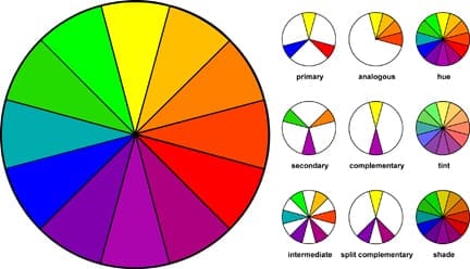
Source: hearthandhedgerow
Use colors in a way that creates balance and visual harmony. Don't use a lot of colors because it can lead to confusion and overwhelm the audience. Then what should you do?
Limit the design to two or three colors. Use different tints, shades, and hues of colors to find the ideal color.
Now that you know how to choose colors for packaging, here are some colors and the psychology behind them.
5 Tips to Consider When Choosing Packaging Colors
Choosing the right packaging color is just the first step. There's more that you should do so your packaging looks good and serves its purpose effectively.
- Experiment with various color harmonies beyond the standard choices. Triadic, tetradic, or analogous color schemes can offer unique and visually appealing combinations that set your packaging apart.
- Before finalizing color choices, create physical prototypes of your packaging. It lets you see how colors interact in real-world conditions and ensures the desired visual impact.
- Develop a signature color for your brand that becomes synonymous with your products. It helps in creating a strong and recognizable brand identity over time.
- High-quality printing significantly impacts how colors appear on packaging. Invest in advanced printing techniques to ensure the final product accurately represents your chosen colors.
Ending Thoughts
By choosing an ideal color palette you can make customers feel certain emotions which compel them to purchase the product. But for that, you should know the psychology of packaging colors and then utilize them for your interest.
Understand the color psychology and then analyze its impact on your customers. Because colors are important in our lives and so in product design.
That's why we don't create generic and boring packaging at Altro Labels. We make high-quality packaging that resonates with your audience. Contact our team of experts today for more information.