Best Fonts for Your Product Labels
Are you running a business? Creating a brand new product to disrupt the market?
Then, you should know how to capture the attention of your customers. One proven way you can pique your customers' interest is eye-catching product labels.
Fonts play a great role in this.
It helps people identify your brand. Imagine your favorite content creator on Instagram. If you analyze their feed, you'll notice they use a specific font for almost all the posts.
Why?
Font selection plays a great role in pushing your business to success, but choosing the right font can be overwhelming, especially if you don't have enough expertise in this area.
So what should you do?
Just read this blog till the end because we'll share everything you need to know about font selection for product labels.
So let's get started.
10 Fonts For Product Labels
Now let's discuss the most important part of this article: the top 10 fonts. After extensive research, here are some of the most used fonts for product labels. They have an immense impact on the psychology of customers.
1. Butler
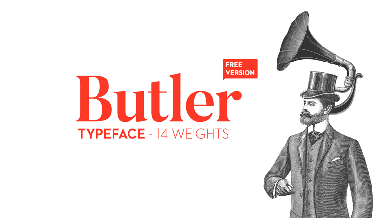
Source: dafont
Butler is a serif typeface. It emanates a luxurious modern look and has an elegant finish. It exudes classical serif styles.
If you're going to the mall and see this font in a retail store, it'll immediately catch your attention. Do you know why?
It's because of fancy curves.
2. Didot
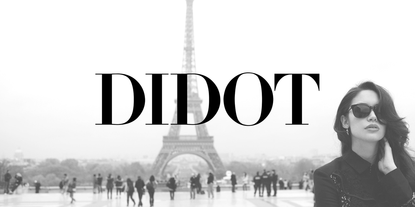
Source: bestfonts
Do you know a famous luxury brand that used this font in their logo?
Yes. The Giorgio Armani logo is an amazing version of Didot. It is ideal for a dramatic and classic look. Moreover, this font is also used in fashion magazines, labels, and luxurious items.
3. Aileron
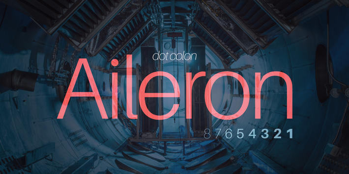
Source: fontsquirrel
It's a font family with an amazing interpretation of the Neo-Grotesque typeface.
Meanwhile, Aileron can be easily distinguished. Do you know how?
It's because of two things.
- Curved lowercase letter “l.”
- On the letters "i" and "j," the dots are rounded.
It gives an overall soft impression to the font.
4. Maison Neue
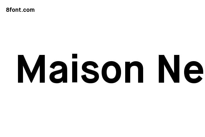
Source: 8font
Do you know where Maison Neue is derived from?
It's adapted from the Maison typeface. Maison Neue is made to make it more usable. It's a functional typeface that gives a contemporary feel. Either way, it's pleasing to the eye and extremely eye-catching.
Maison Neue is a suitable choice if you want to cover your brand with a classy font. It's playful, so you can use it for your skincare brand and sophisticated to use on whiskey packaging.
5. Sofia
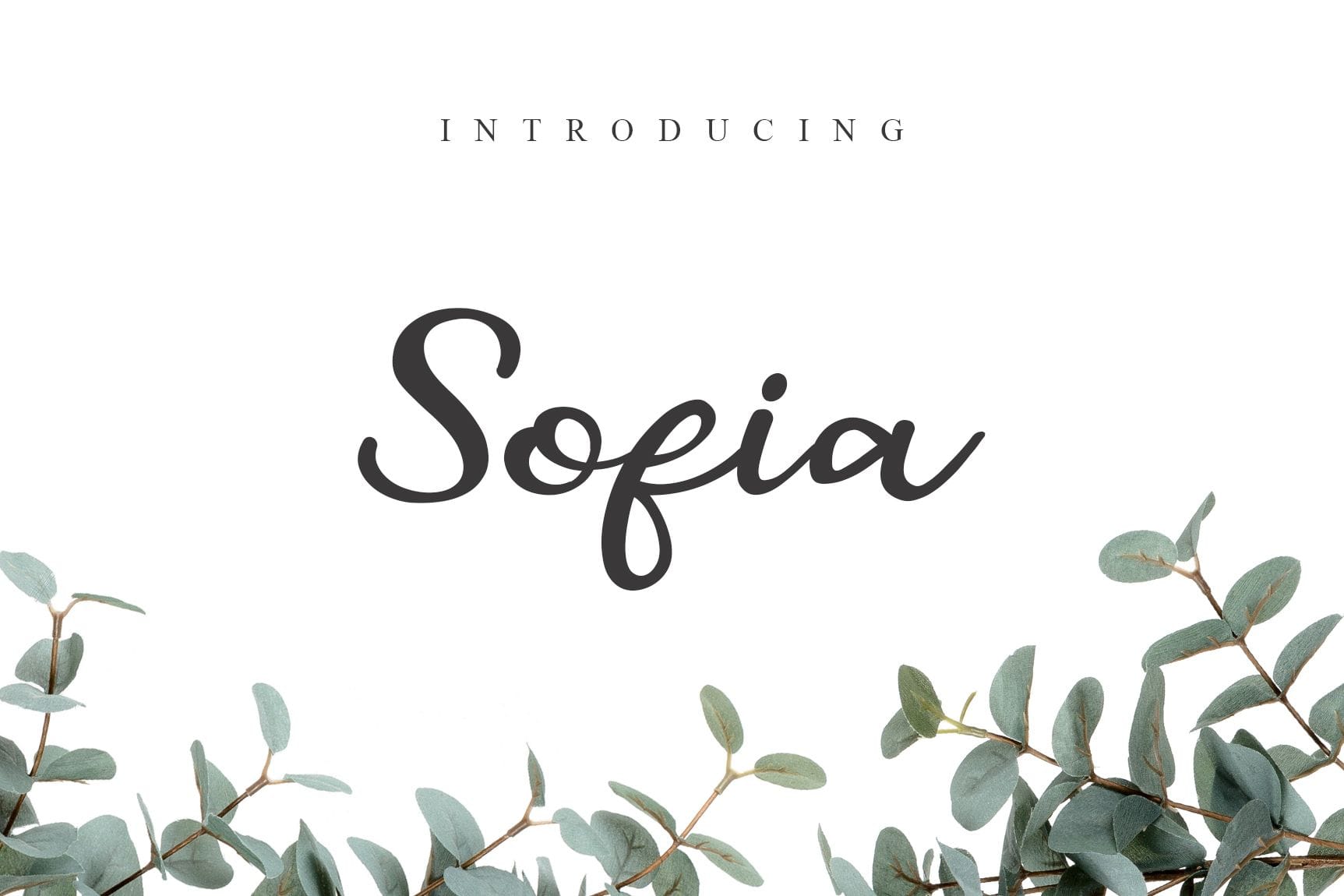
Source: pinterest
With this font, you can give your audience a warm and comforting feeling. It's a geometric sans serif font most suitable for minimalism lovers.
You may think it looks ordinary and nothing special at all. But the biggest power is that it's easy to read, which makes it outshine.
If you want to give your products a humanistic feel, try this font. From hair sprays to baby care products, sanitizers to coffee bean packaging, Sofia will work for all of these product labels.
6. Satisfy
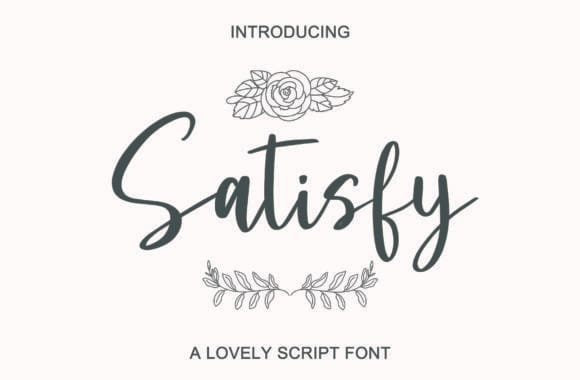
Source: creativefabrica
Do you want to add extra fun and luxury to your label packaging?
Then Satisfy can deliver that. This brush script is elegant and a timeless classic. If you want to add a tagline to your product packaging, this font will get the job done.
If you've food products more precisely related to desserts, pastries, brownies, and cakes, then use Satisfy. If you carefully combine the right font, you can easily make your labels more graceful.
7. Garamond
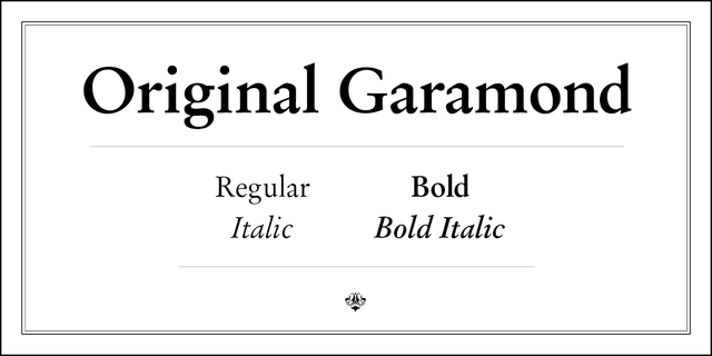
Source: rentafont
You'll usually see this font in printing books. But does that mean you can't use it for your labels?
No.
The truth is that it's widely used in books because of its readability. It's light with a thin side, which leaves necessary space. Garamond is a great choice if you sell a premium product and want to emphasize its high quality.
8. Helvetica
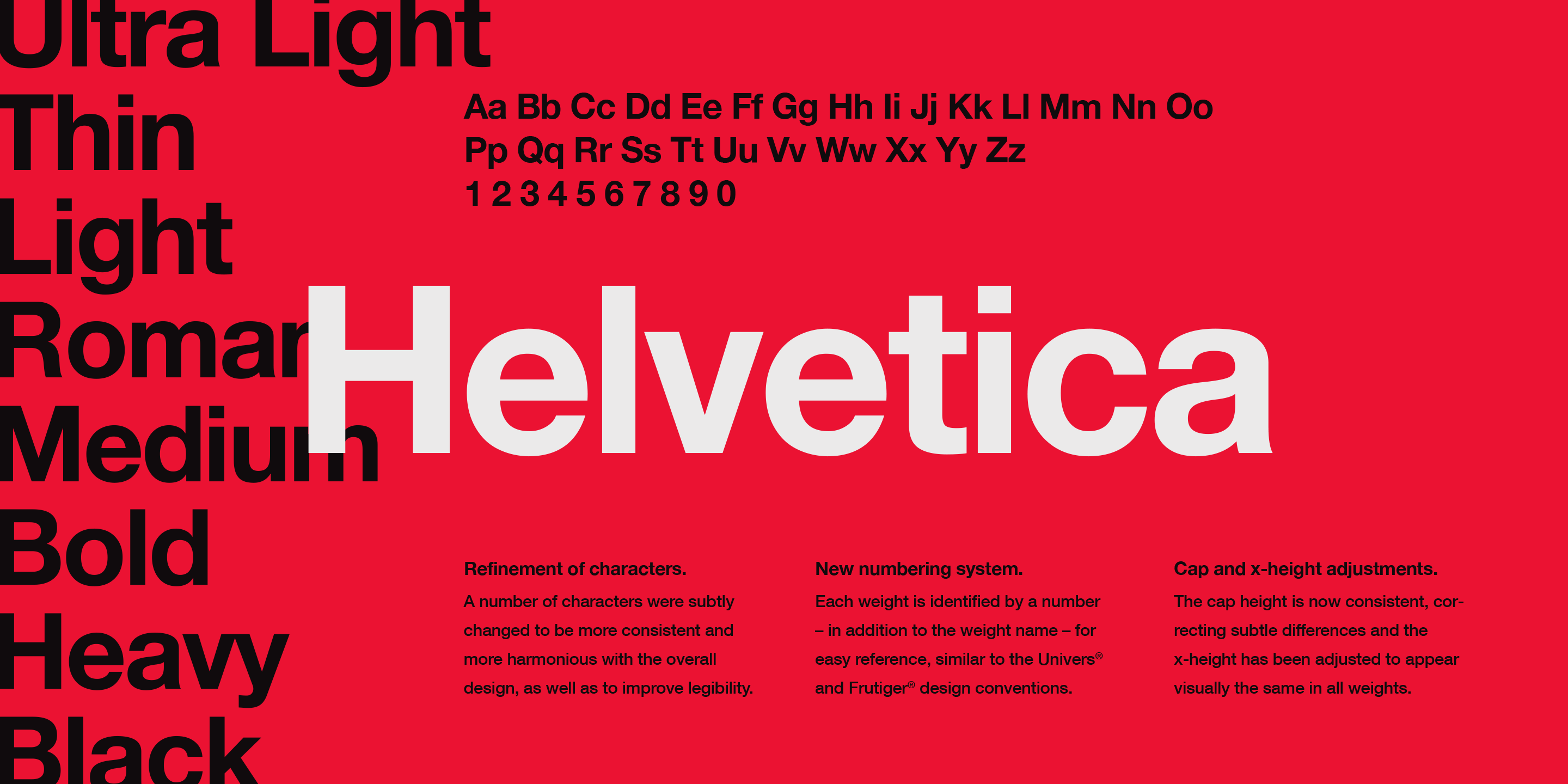
Source: fonts
Do you have a revolutionary product?
A modern product?
Helvetica is ideal for your needs. This bold and strong font was made for signage. That's why you'll still see it in ads, flyers, and labels. It's widely used for packaging with a clean and neutral tone.
9. Habisa
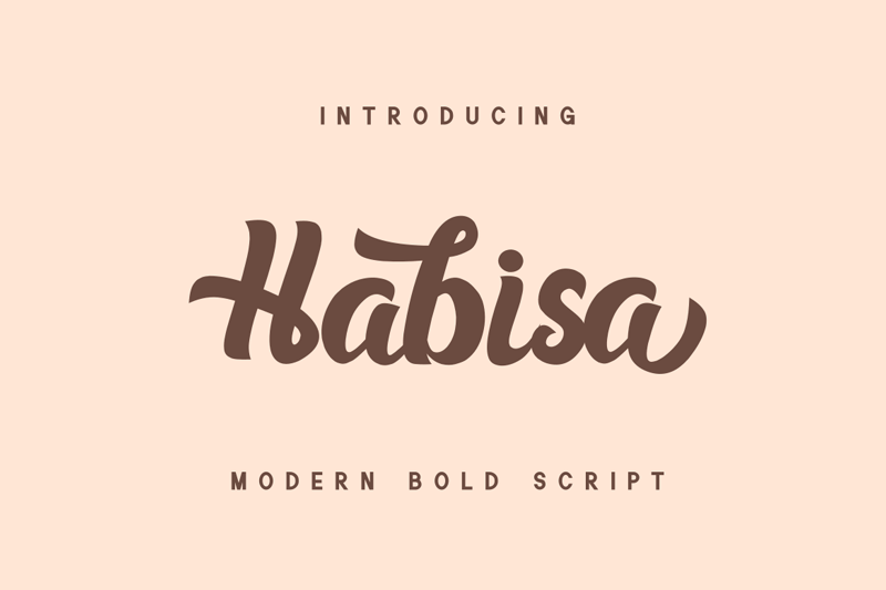
Source: dafont
It's a modern handwritten font that has a realistic style. This font is inspired by premium, luxurious goods with stylish letters that'll level up your latest designs.
If you use this font in Photoshop and Illustrator, you'll get access to some characters of Habisa with swashes.
10. Bristain Rought Serif Font
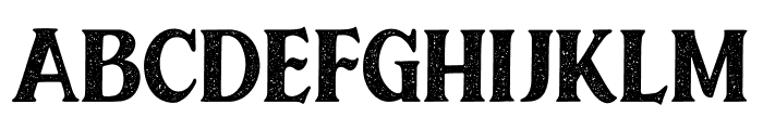
Source: whatfontis
Do you like grunge?
Is your audience a huge fan of it?
Thus, if you're running a brand that deals with motorcycles, helmets, and related pieces, choose Bristain Rought. In a nutshell, it's packaged with sporting vintage energy. It's a bundle that helps you communicate your business ideals with your audience.
Step-by-step Guide For Choosing Suitable Font For Your Products
Now that you have a clear idea of different fonts, it's time to understand the process and steps for choosing a suitable font for product labels. Remember, leaving a good first impression is extremely crucial.
Step 1: Focus on Readability and Legibility
Imagine looking at a product label that is extremely hard to read. You can't even read the product's name because of the complex font style.
Most probably, you won't even purchase the product. So, you should opt for a readable font size.
Choose typefaces that have clear and distinct letterforms.
Step 2: Understand Your Brand Identity
Every brand has a unique identity and values they follow. Look at your brand and ask yourself how you want people to perceive your brand.
- Happy?
- Cheerful?
- Corporate?
Be clear about it, and then you'll be able to find the right font combination. Once you choose it, stay consistent with the brand's identity.
Chosen Font = Reflects Brand Personality & Values.
Step 3: Know Your Target Audience
You're making a product for the audience, so choose the fonts your audience likes the most. What does that mean?
Understand your target audience and identify their demographics, characteristics, and preferences.
If your audience likes simple things, then choose something elegant yet simple. Thoroughly research different fonts and understand font personalities.
Step 4: Understand Intricacies Of Fonts
Understand typefaces of fonts. Learn about what they convey and do that aligns with your brand. Here's a quick glimpse.
- Serif fonts convey tradition and formality.
- Sans-serif fonts offer a modern and clean aesthetic.
You can also create customized decorative fonts to add a personal touch to your product labels. They are expensive, but it's an investment that is worth it.
Step 5: Analyze Your Competitors
Your competition can tell you a lot about the market. Analyze successful product labels within your niche and understand how they enhance brand recognition.
What results are they getting?
Do customers love their product labels?
You can go one step ahead by conducting surveys from the target audience regarding font preferences.
Step 6: Pair Fonts Strategically
By now, you should have a list of two to three fonts for your product labels. Utilize strategies to combine fonts. Choose fonts that complement each other to create visual interest and maintain a cohesive design.
You can establish a hierarchy using different fonts for product names, details, and additional information.
Step 7: Test Fonts in Various Contexts
The font you choose might look perfect digitally, but to make sure it looks as good in reality, you should have some sample labels.
That's how you'll see how fonts appear in real-world conditions. Your font should be readable in all formats and sizes.
Label Font Do's And Don'ts
Even small label font mistakes can be disastrous. It can cost you a lot of money, time and effort. Here are some label font do's and don'ts to save you from this hassle.
5 Tools for Font Selection
But are there any tools that can help you in this journey?
Yes. Here are the top five tools that you can use for font selection and to make the process easier.
- Google Fonts: Offers various free, open-source fonts for web projects.
- Adobe Fonts (formerly Typekit): Provides a diverse selection of high-quality fonts for creative projects.
- Font Squirrel: Offers a collection of free fonts and a web font generator.
- DaFont: A platform where you can find many free fonts for personal use.
- Font Awesome: Primarily used for icons, but it also includes a variety of customizable fonts.
Final Thoughts
Your product label is the first thing customers notice. If you want them to purchase your product, you should focus on every aspect of product labels. Everything matters greatly, from color to font selection and material to content.
Remember, these fonts should embody your company's tone, style, and personality. It's a two-way communication with your target audience.
Want experts to handle everything for you?
We are Altrolabels, a custom labels printing agency that handles all their clients' printing needs. If you want your product labels to have a premium, high-quality look, then don't hesitate to contact us.