
Label of the week: Hypha Project. What it takes to create your perfect label
Today, we will learn more about unique ways for your brewery to stand out and share Hypha Project's example of creative ways of designing its labels.
Hypha Project is not your typical beer company. Not your typical labels. It was good luck and fortune to find them, but our values sure lined up. The HYPHA Project was founded by Cris Ohama, Ben Regan, and Chris Charron. Their main vision was to release an ongoing series of limited-edition single-batch beers with cans designed by local artists.
It all starts with a thought
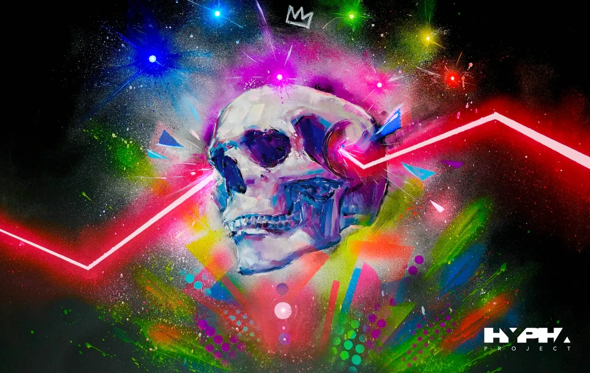
There are many different kinds of labels. And it can get tough to decide which is the RIGHT one for your brand. You want to share your vision and idea but at the same time, make sure that you create this instant connection with your customers. Hypha Project has a very special way of achieving that. Working with local artists ensures that each design will be unique and will cover different audiences. Let’s take a look at one of their new releases Inceptional IPA.
The packaging for Inceptional features artwork by Tokyo-born and BC-based artist Taka Sudo, who describes his work as “scattered abstract elements composed of neon color, neutral color, newsprint, and photo collage assemble into organic shapes, to find out strong true energy among real and unreal.”
What you need to know before designing your label:
1. Bottles vs. Cans
It all starts with that first decision. But it gets tricky because there are many pros and cons to both bottles and cans. Do you want your beer to be perfect for the urban crowd, or would your beverage be more suited to a less formal audience? For instance, if you want it to be perfect for beaches, then you want to consider can because of its functionality. Bottles might be your choice for nice dinners and parties because of their aesthetic purposes.
But at the end of the day, to make the right decision, you need to understand what your branding strategy is.
2. Label shape and size
You can go with the standard sizes and shapes, or another option will be to choose a die-cut label. As more breweries value their own creativity and unique identity, they tend to select the latter option. It will allow you to personalize your label a little bit more and let your brave ideas come to life. Although this label choice might be a bit more expensive, it could be very well worth the in the long run.
Some sizes and shapes to consider are crowlers, growlers, or stubbies, cone shapes, and a longneck.
3. Colors and Typography
As you decide what your can will look like, it is time to ensure that your colors and text work well on the label. For example, a light-on-light combination can make the fine print challenging to read. Same, if you do dark-on-dark. So, you want to differentiate those two and arrive at a decent contrast in design elements.
Beyond the surface appeal, there’s also some psychology at play. For example, one Oxford University researcher found that products packaged with the color red tend to taste sweeter. For other color descriptions, take a look at this list:
Orange – Energetic, invigorating, enthusiastic
Black – Luxurious and elegant
Yellow – Playful, optimistic
Purple – Creative, successful, wise
Green – Safe, but strongly associated with different factors like nature or money.
Pink – Youthful, loving, feminine
White – Clean and pure
Blue – Confident and serious
5. Style and pictures
If your goal is to appeal to younger customers, adopt an outlandish design style. For the less experimental older crowd, a minimalist style would do the trick. To decide which one will be better for your company, you need to consider who is your target audience and what are their preferences.
Are you a partner? Do you have a custom label that you would like us to feature? Send us an email at info@altrolabels.com with the subject line "FeatureMyLabel", and we'll be happy to take a look!