
Color Psychology in Visual Merchandising
Customers are bombarded with several options when they walk down the street. Your competitors in the block are fighting to get their attention. How can you stand out in the market? Is there any way to do that?
Yes. There is.
It's making an unforgettable first impression. Attracting customers to your stores is easily possible by focusing on visual merchandising. It makes a strong impact on your customers. Remember that colors are a crucial component of visual merchandising. It has a great influence on customer choices.
You can increase sales and capture the undivided attention of customers. With creative visual merchandising, you can make this possible. But what is visual merchandising? What role does it play in appealing to customers?
In this article, you'll learn everything about color psychology in visual merchandising and much more. So, let's get started.
What Is Color Psychology?
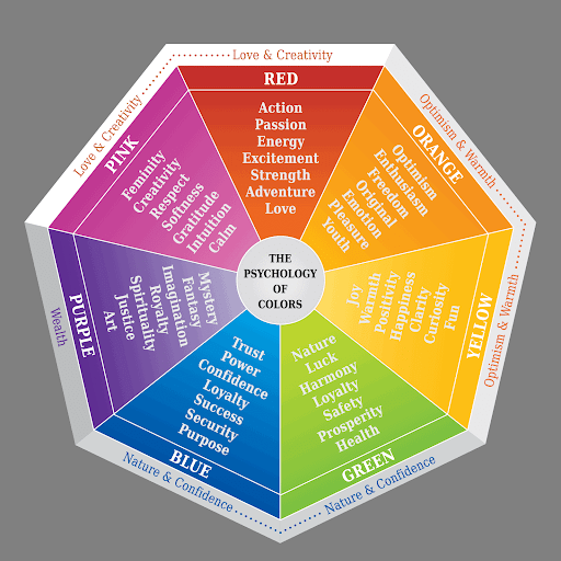
Source: elevate
Color psychology is a specialized study of how colors impact different aspects of humans. It includes emotions, cognition, behavior, and perception. Generally, colors trigger neurological and physiological responses in humans, leading to specific emotional reactions.
But what is color psychology in retail?
In retail, color psychology is a tool to shape customers' perceptions. Brands intricately use color psychology that aligns with customers' choices, identities, and details. Here's how it goes.
Research colors → Carefully use colors → Impacts customer decisions → More sales.
Integrating color psychology in retail requires a deep understanding of how colors impact human psychology. Focusing on creating visual harmony is crucial. You need to strategically choose and combine colors accordingly. It should communicate brand values and messages and directly impact customer purchasing decisions.
What Is Visual Merchandising?
Visual merchandising is a common retail practice that aims to optimize the products and services offered to potential customers. The primary focus is creating an attractive, engaging atmosphere that pulls customers closer to purchasing. Specific tools, displays, layouts, and elements are used in visual merchandising.
But the most important of them all is the usage of colors. The experience of visual merchandising begins with signage outside the store. It continues inside the store to draw the attention of customers.
In a nutshell, every single detail should be directed towards providing a unique customer experience. Everyone uses this technique, from small shops to big retail stores.
7 Strategies To Use Color In Retail Visual Merchandising
To win the hearts of your customers, you need to use all the colors effectively. There are many strategies and techniques for this purpose. It allows you to create compelling and impactful displays. Here are some visual merchandising methods that lay a strong foundation for this practice.
Color Blocking
It's a procedure that includes juxtaposing contrasting colors. It draws attention to a specific product, thus making it the center of attention. The adjustment of contrast enhances focus even more.
How can we use it practically?
It's when brightly colored items are placed against a muted backdrop. It creates a beautiful visual contrast, which makes the items stand out. So even among thousands of products, customers' eyes become fixated on a particular product. Thus increasing the curiosity of customers and encouraging them to explore more.
Monochromatic Schemes
Monochromatic schemes give a sense of elegance and cohesion. But what does it mean?
In this, varying shades, hues, and tones of a single color are used throughout the display. It creates a sense of harmony and balance. A display with a blue color creates a visually pleasing and aesthetic arrangement.
Overall, monochromatic displays exude sophistication. It offers a clean and elegant shopping experience. If you're showcasing different categories or themes, then using monochromatic schemes is a great choice.
Seasonal Adaptation
Staying up-to-date with trends is becoming more important than ever. You've to stay relevant with your customers. An incredible way to achieve that is by adapting color schemes to match seasons and holidays. But for this, you have to know about colors.
Warm and earthy tones are used in winter. Meanwhile, in spring, pastels work the best. You can also try this technique for holidays like Christmas, Halloween, or Thanksgiving.
It shows customers that you're more than just a mall or shop around the corner. Thus building strong emotional connections with shoppers and repeat visits.
Color Harmony
Do you ever go to a retail store, and everything seems like a mess? But there's nothing specific you can pinpoint. What's the issue here?
It might be poor usage of the color palette.
Color harmony is a crucial aspect of visual merchandising. You should use techniques like complementary or analogous schemes to minimize this visual imbalance. They work together to ensure that colors look harmonious and perfectly blend.
Complementary colors create contrast and vibrancy. These colors are blue, orange, etc. Meanwhile, analogous colors provide a serene and coordinated feel. These colors are blue, green, etc.
Tell A Story
Your visual merchandising strategy shouldn't be boring. It should tell a story, and how can you do that?
First, create a narrative. Then, make a specific message you want to convey to your customers. Brands can leverage this strategy to communicate their brand values.
For example, a display of earthy times, like green and organic textures, tells us about commitment to eco-friendliness. It's a great way to tell customers that you are eco-friendly. Moreover, it attracts eco-conscious customers, thus telling us you can easily create deep connections with customers who share similar values.
Accent Color
It includes focusing on a single contrasting color into a harmonious display. Your accent color draws attention not to the overall product but to specific elements. It can provide details of products, pricing, or promotional messages.
Accent colors = Visual cues
It guides customers to critical signage information that might be missed easily. This sense of hierarchy enhances the overall impact of the display.
A boutique backdrop has an overall neutral tone. However, some accent colors immediately draw attention to specific details. That's how you can intricately combine visual merchandising in the growth of your retail store.
Color Sequencing
It's all about creating a memorable visual journey for your customers. Color sequencing includes arranging products and displaying elements in specific color sequences. Let's understand this example.
A display may start initially with warm color tones. But slowly, it transitions to energetic tones. This transition is extremely crucial and creates a meaningful visual journey. It also reflects customers' emotional progression.
It helps customers dive deeper into a curated shopping experience. Thus, you can easily encourage them to make the decisions towards purchasing a product.
Example Of Visual Merchandising
You might wonder if visual merchandising it's applicable or not.
Big and small stores widely use this method. Now, let's look at the three best examples of visual merchandising. It'll give you deep insights about how they incorporate this strategy and what you can learn from them.
Starbucks
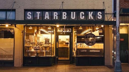
Source: starbucks
If you visit Starbucks, you'll sense a feeling of harmony. The overall atmosphere gives cozy vibes.
It's because of using earthy tones like green and brown in their store and branding. These colors evoke a sense of warmth, comfort, and naturalness. It aligns with the company's commitment to providing a cozy and welcoming environment. So customers are more inclined to enjoy their coffee.
Furthermore, Starbucks incorporates vibrant colors like red and yellow in seasonal promotions. They have truly mastered the art of drawing attention with their packaging.
Sephora
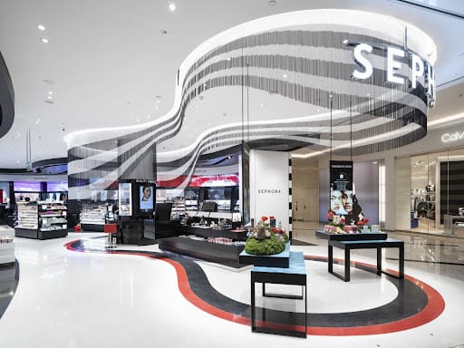
Source: globalcosmeticsnews
The Sephora store is designed in black and white colors. If you look closely, you'll notice accents of bold, vibrant colors such as red and hot pink. It's because black and white colors provide a sense of elegance, sophistication, and luxury.
Pops of colors add excitement and playfulness to the retail environment. Sephora also strategically uses color-coded signage and displays for product categorization. It makes the store easy to navigate.
IKEA
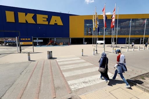
Source: brecorder
The layout and design of IKEA is full of bright and airy color schemes. The white walls, natural wood tones, and pops of vibrant colors like yellow, blue, and red make the atmosphere feel like home.
The colors create a sense of openness, warmth, and accessibility. That's why customers spend hours exploring the store.
Tips For Color Psychology In Visual Merchandising
People often think that just adding blue or a bright color is enough. That's not true.
You've to strategically implement color psychology in visual merchandising. Here are some tips for this purpose.
- Use Unexpected Color Combinations: Don't hesitate to experiment with unconventional color pairings. However, they should create visually striking displays that capture attention.
- Think Beyond the Visual: Color psychology goes beyond what your customer can just see. It should influence other senses of humans as well. Using appetizing colors like red and orange in a food display can stimulate appetite and encourage impulse purchases.
- Personalize the Experience: When choosing colors, consider your target audience's age, gender, and background. Millennials do not welcome the colors the younger audience loves, so personalize the experience for your customers accordingly.
Ending Thoughts
Visual merchandising is not a new phenomenon. It's been around for a while, and businesses use it to their fullest advantage. You can take it to the next level by incorporating interesting elements.
You should implement innovative and creative techniques. Remember that competition is becoming fierce, and you can't rely on traditional strategies to grow anymore. Utilizing visual merchandising for every retail store is a need of the hour. Transform your customers' shopping experience to keep them hooked and encourage them to return to your retail store.
If you want to take your business to the next level by adding visual appeal. Then, reach out to Altro Labels today. Our team of experts is ready to assist you 24/7. So, let's make your business successful.